Timeline
June 2021 - August 2021
My Role
Web Designer
Team
Design Team of 3
Tools
Figma, Slack
What is AI-Learners?
AI-Learners is a Cornell start-up that makes learning easier, personalized, and more fun for kids with learning disabilities through educational math games and data analytics.
I joined AI-Learnes as a web designer, working with the Game Development, Software Development, and Business teams to design new platform features that would provide more variety and attract customers.
I worked on five meaningful design projects with AI-Learners. Each brought the company a step closer to acheiving their design goals and making a beautiful, accessible platform that parents, educators, therapists, and disabled students would enjoy using.
Project 1: UI Kit Redesign

Redesigning the UI Kit was not part of the original sprint plans; but, after I explored the website and company Figma pages, I suggested to my project manager that the current UI style could use a refresher.
Goal: design new UI that reflects current design trends and create a consistent, intuitive experience for the user.
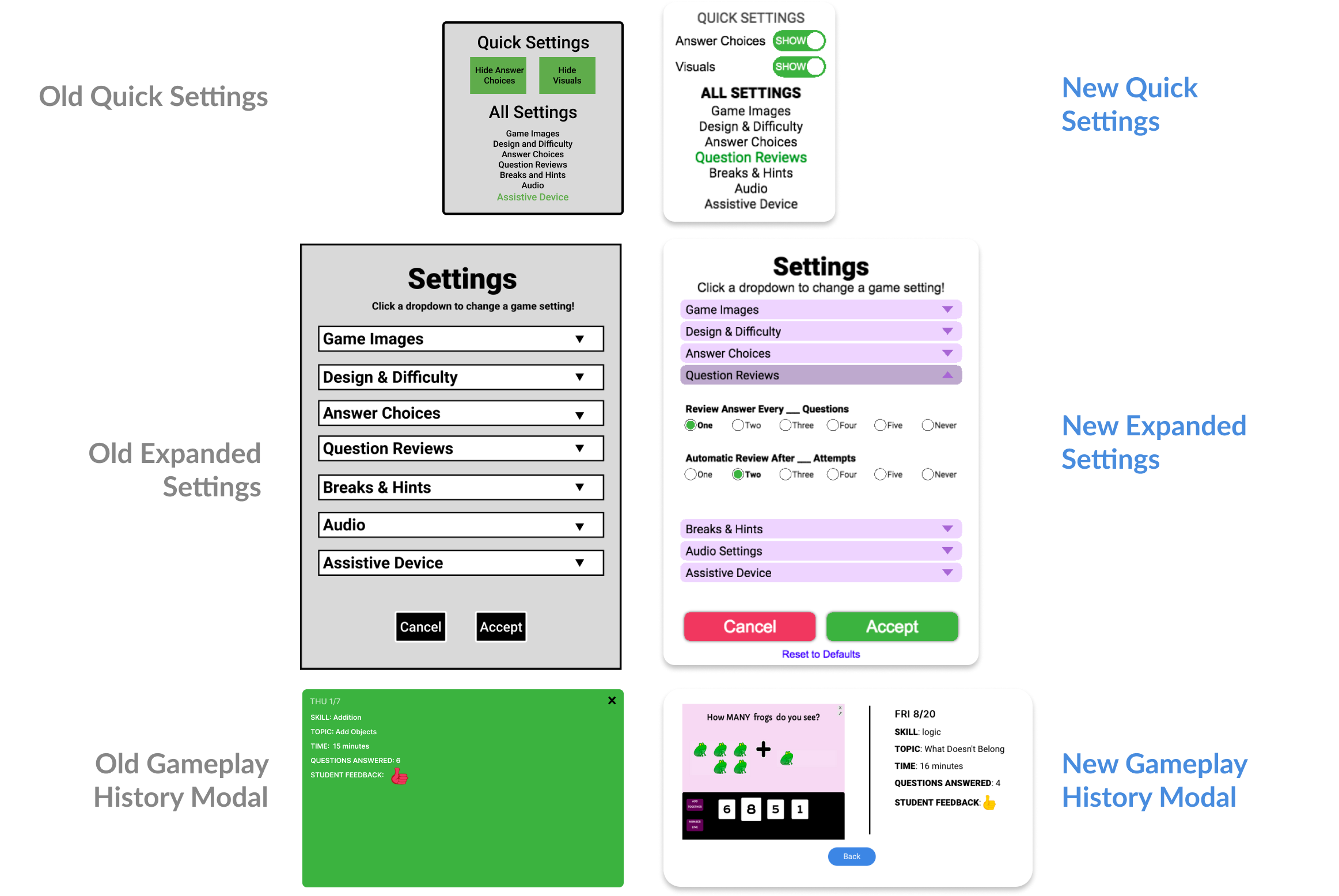
After getting approval for the project, I documented everything that would need to be redesigned. The rest of the design team pitched in to help me expand and improve the UI Kit by making new buttons, headers, footers,toggles, and pop-ups, and more. We wanted softer edges with high color contrast in order to make it accessible for kids with disabilities.
Overhauling the UI Kit set the tone for the rest of our design projects that summer.

Project 2: Figma Reorganization
Since we often had to communicate with other teams, we realized that when we asked developers to implement new design changes or business to offer feedback, every designer had their own preferred method when it came to structuring their drafts and writing edit changes. Over the course of the summer, I formalized and documented the structure and organization of our company Figma pages.
Goal: organize Figma files in a way that clearly and immediately conveys design ideas, thus streamlining communication with other teams.
Not only did writing up a formal document help to standardize the style and flow of our designs, developers were able to quickly pinpoint what we wanted them to implement. Leaving design feedback for each other also became easier, as we could tell what was being currently worked on and what was an archived idea.
Project 3: Page Redesign
Goal: refine current page designs in order to provide accurate visual data representation and improve visibility.
The Analytics pages on Figma did not reflect the current published pages on AI-Learners' website. Additionally, there were design inconsistencies across all five pages. I worked with my design peers to adjust small details and refine the wording for all pages.
This page is primarily for parents and educators who want to check on their student's progress. It was crucial to make sure that all the data is clearly illustrated and that our progress trackers are easy to understand.

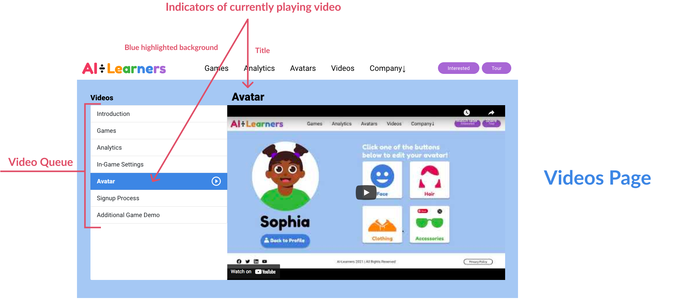
On the old videos page, it was not clear what video was currently playing, what video would play next, and what video was already watched. I referenced YouTube's playlist design to create a layout that would distinctly display the system status.

Project 4: Landing Page
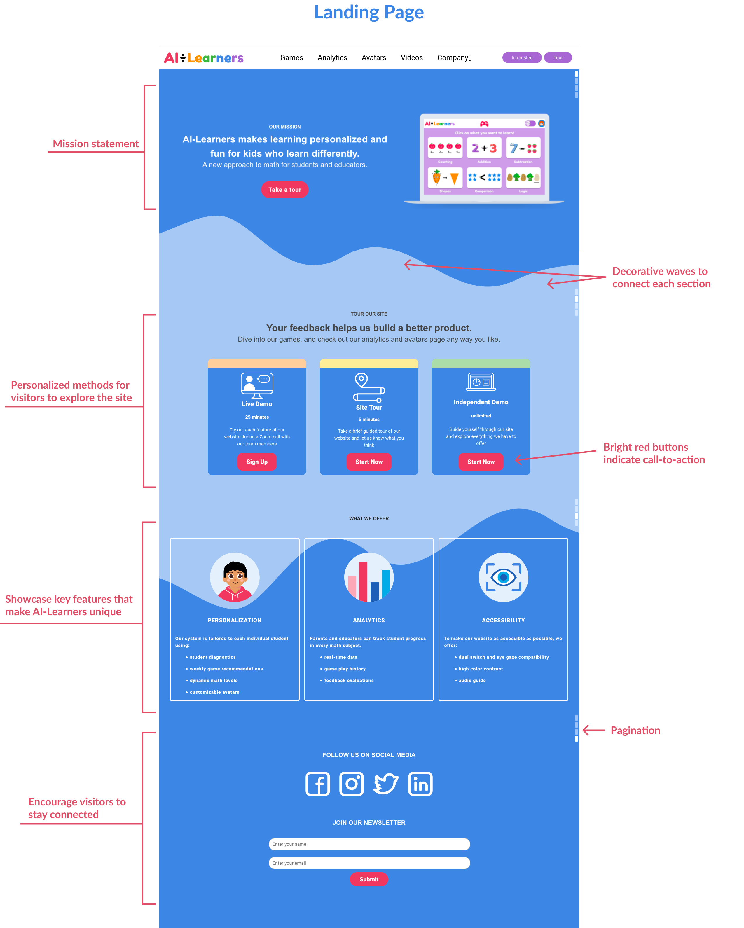
Every company has a landing page that tells the visitor what the company is about and what makes their product special. Based on user research done by the business teams, the design team outlined different user goals and how we could address each of their goals and interests through our landing page.
Goal: showcase AI-Learners' mission, product, and definitive selling points by utilizing informative visuals and content hierarchy strategy.
We analyzed other education companies' landing pages and worked closely with the AI-Learners business team in order to understand what sort of content would best fit. Additionally, we wanted emphasize the availabilty of site tours amongst the flow of information. We settled on a simple, easily scannable layout that could tell the user a lot in little words.
(As a bonus, I got to dabble in iconography for the first time!)

Project 5: Company Page
We used angled shapes and lines to make it visually distinctive from the other pages, but kept the bold blockiness to make sure it was still in line with the brand. We also gave each section of the company a different color; pink for the mission statement, since it was brightest and most eye-catching, and so on. It was important to show images of the children we wanted to help and the team of people working behind the scenes, because we wanted visitors (parents and teachers) to be able to put a face to the name and know that we are trustworthy.
Conclusion
AI-Learners taught me a lot about usability, accessibility, and designing for the target user. Although much of AI-Learners' design style don't match the standards of big design-forward companies like Google and Meta, I understood how crucial it was that we design UI with our specific user, children with learning disabilities, in mind. Working with other UX designers and my manager on these projects was a lot of fun, and I love UX design even more after this experience.